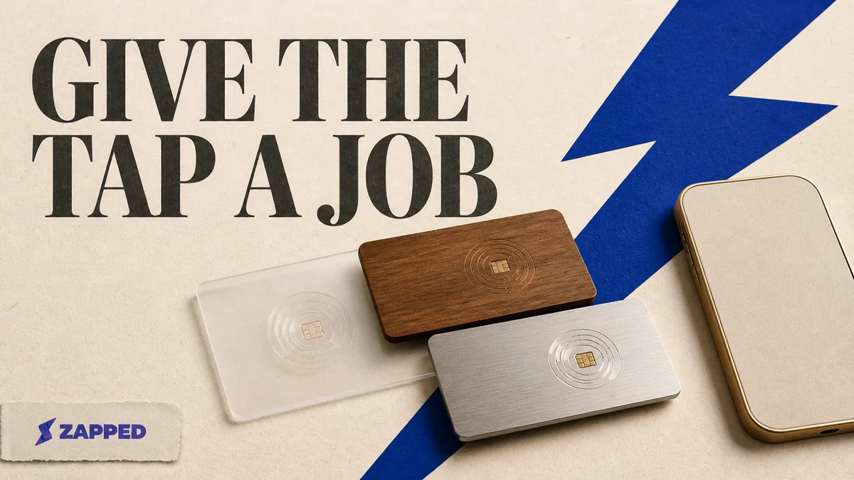
The best NFC business card example gives the recipient an obvious next step. It isn't the one that wins a beauty contest. Pick the job first, send the tap to a destination you can change, and print a QR fallback before you order a stack.
That turns a card from a pretty object into a small handoff system. The material, tag, destination, profile features, and test all have to agree. If one fails, the finish won't save the introduction.
Start with the job, not the finish
Most NFC card galleries show surfaces well. Pinterest's NFC ideas can help you collect visual references, but an inspiration page won't tell you whether a tap opens a profile, a vCard, a review form, or a stale link. That's the decision hiding underneath the mockup.
For a personal introduction, the job may be simple contact sharing. The tap should open something that lets the recipient understand who you are and save your details without hunting. For a salesperson or event team, the card may need contact capture, analytics, brand control, or a destination you can update after the printed card is already in circulation.
That changes the example worth copying. A metal card with a restrained logo suits a tactile introduction. Colorful PVC gives a designer more room to make the handoff recognizable. A maker template makes sense for a small run or a physical build you want to control. None of those choices fixes a bad destination.
Four physical routes worth copying
PVC and specialty print for a familiar handoff
PVC is the practical, design led route. Print Peppermint's NFC card section presents embedded NFC in PVC with matte lamination, alongside metal, plastic, and wood options. It's a useful reference when the card needs to feel like a recognizable business card first and a piece of hardware second.
The material leaves room for a clear visual system: name, role, restrained mark, and a QR fallback that doesn't look bolted on. Keep the tag area viable while you place those elements. The design should tell the recipient where to tap or scan without becoming an instruction sheet.
If production accuracy matters more than making every choice yourself, Print Peppermint also describes a vendor assisted path with concept exploration, human production review, production artwork, and proof approval before printing. That's the route for a design you want checked by another set of eyes before it becomes a physical mistake.
For decoration after you've chosen the card's job, material, and destination, see decorate your NFC cards. The visual treatment matters. It comes after the handoff works.
Metal or wood for the tactile statement
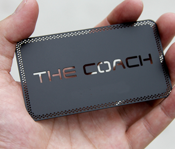
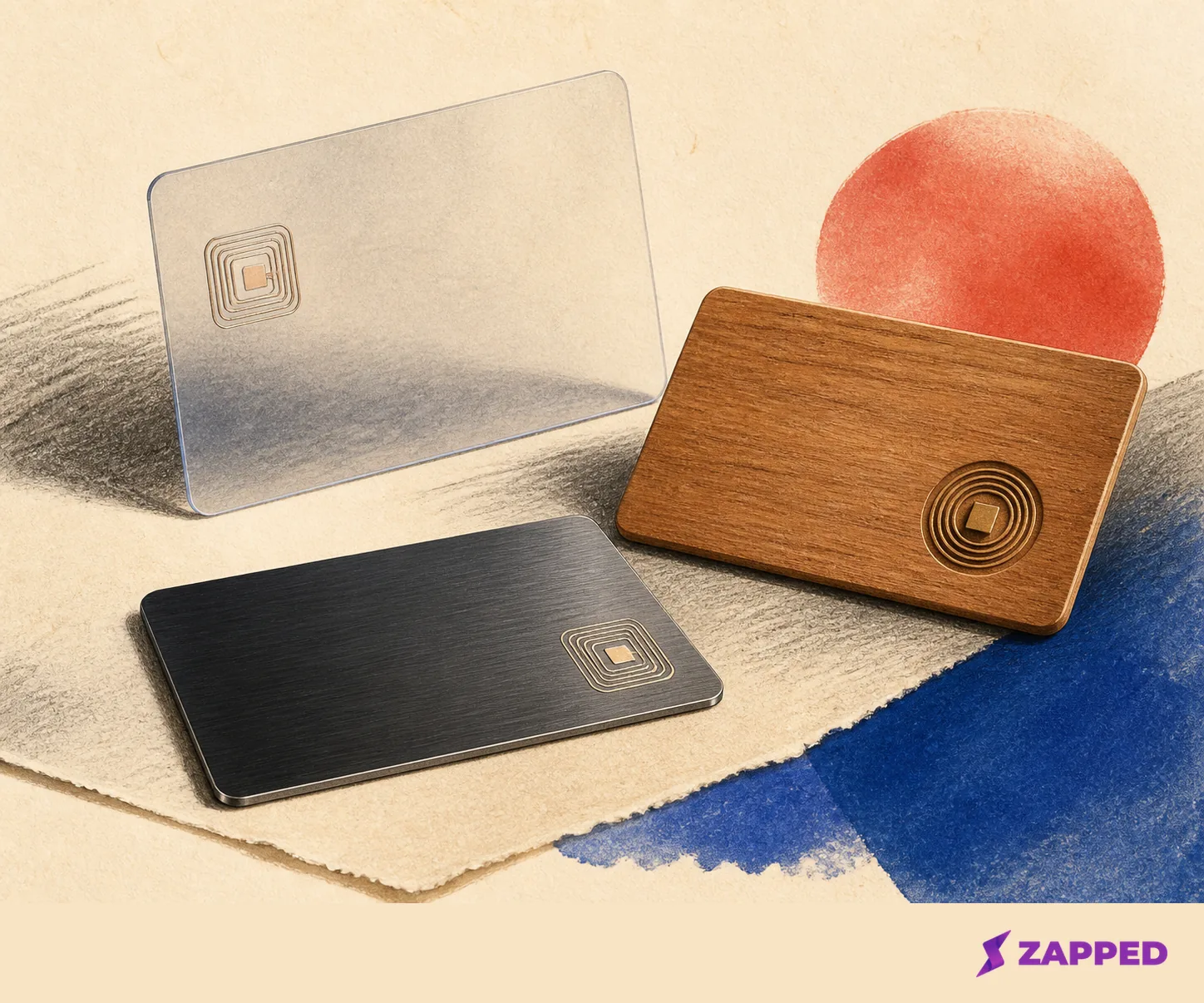
Metal and wood make the card feel deliberate. RockDesign's minimalist example uses a 0.5 mm black anodized stainless steel card with white ink, UV printing, a tag built into it, and an NTAG215 option. It's a strong model for a quiet, high contrast card where the material does much of the talking.
The tradeoff is constraint. A template can lock in font choices and placement rules, and the tag area still has to work after the surface treatment and layout are settled. Check those rules before ordering. A beautiful fixed template with no useful place for the QR code is a design exercise, not a dependable handoff.
Wood follows the same logic with a warmer feel. Blinq's creation path includes standard, metal, wooden, and custom NFC cards, and its physical cards include a printed QR code for phones without NFC. Blinq also notes that iPhone and Android readers use different tap areas. The fallback belongs in the concept from the start.
Vendor assisted artwork for proofed production
This route is for a design that has to survive repetition. You bring the visual direction, the printer handles the production artwork, and a proof gives you a chance to catch a tiny type or placement problem before it becomes a box of cards.
Use it when the card is part of a brand system, when several people need the same result, or when a specialty material raises the cost of a mistake. It is less satisfying than building the whole thing yourself. It is also less likely to leave you with a stack of attractive objects that need a redesign.
A maker template for a small self build
The maker route keeps the physical cost low and the process in your own hands. MakerWorld's free template is split into two printable halves, with an NFC sticker embedded in the final step. The listing gives approximate dimensions of 80 mm by 50 mm by 0.9 mm and says pictured stickers typically cost under 20 cents in bulk.
That's a real advantage for prototypes, small events, or a card you expect to revise. It also moves quality control onto you. Confirm the sticker placement, print alignment, surface durability, and QR readability before you make the full batch.
An ambitious maker example can go further. An Instructables PCB NFC project covers hardware design, build, and testing. Copy that route for the engineering project, not because a custom board is automatically a better networking card. A card can be a fun build and still be the wrong object for a room full of people who need to save your contact in ten seconds.
Price the object and the support separately
Polished examples can get expensive in two different ways. You may pay for the card once, then pay again for the profile, analytics, team controls, or contact capture that keep the digital side useful.
Tap Tag's US catalog, checked in August 2026, runs from $2.00 for samples and $3.95 for a classic card to $79.95 for a stainless steel card with gold plating. It also lists custom plastic from $29.95, bamboo and cherry wood at $26.95, anodized steel from $49.95, and premium brass at $59.95. The same catalog exposes digital profile, review capture, team, and bulk order paths.
Before you buy, ask two separate questions: what does the card cost, and what keeps the digital side useful after the introduction?
| Route | Best fit | What the checked example tells you |
|---|---|---|
| PVC or specialty print | A familiar, design led introduction | Embedded NFC, matte lamination, and several material options are available through a vendor assisted route. |
| Metal | A restrained tactile statement | A named template uses 0.5 mm anodized stainless steel, white ink, UV printing, and a tag built into the card. |
| Wood | A warmer physical impression | Wood appears as a material route in both vendor and card platform examples. |
| Maker template | Prototypes and small self builds | A free two part template uses an NFC sticker, with approximate 80 mm by 50 mm by 0.9 mm dimensions. |
If the job is contact sharing for one person, free digital support may be enough. Blinq's monthly pricing lists Free at $0 forever with two digital business cards, Premium at $9.99 per month, and Business at $6.99 per month per user. Business adds team card management, custom templates and brand control, lead capture and enrichment, event campaigns and attribution, CRM integrations, and individual and team analytics.
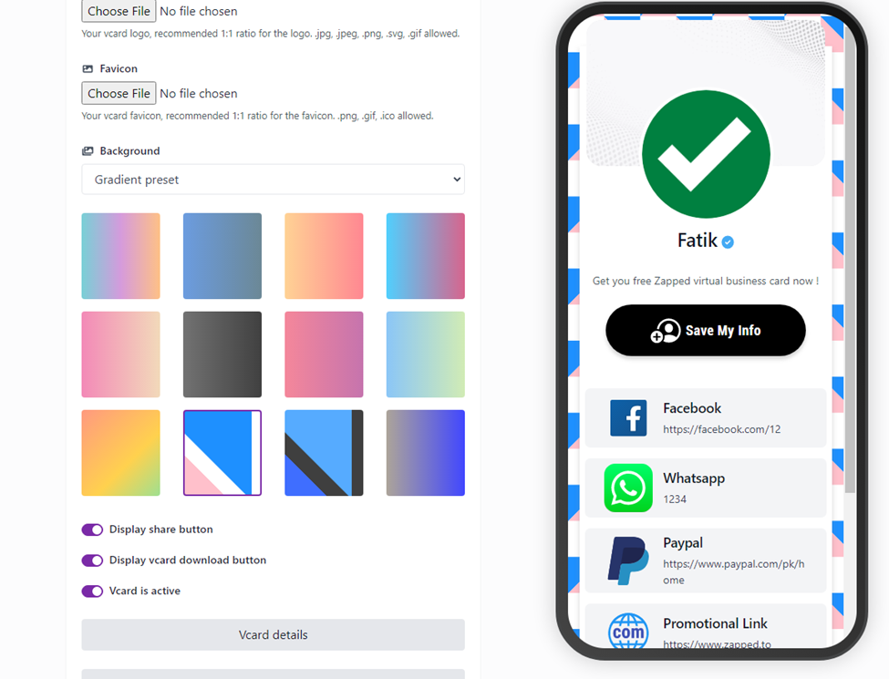
Zapped takes a browser first route. A card opens from a QR code, NFC tap, or link in a normal browser, with no app to install, and the destination can be updated after sharing. When checked in August 2026 in monthly billing, its Free plan was $0, Starter was $14 per month, and Professional was $49 per month. All three include QR, link, and NFC sharing. Analytics history is 60, 185, and 365 days respectively, while team workspaces are none, two, and five.
The Free plan gives one card and five content blocks, and carries a Zapped badge. Professional is the tier that removes the badge and adds full brand control. That's a straightforward tradeoff, not a reason to force a paid plan onto a one person card. Pay when you need a working system for multiple cards, campaigns, analytics, and people. If you need one editable destination, keep the simpler plan.
Choose the destination before you write the tag
The physical example is the shell. The destination is the part you'll live with.
A self hosted vCard or URL gives you control over the domain and file. In an r/NFC discussion, one commenter describes using NFC Tools with a vCard hosted on Google Drive and a printed QR code as backup. Another describes self hosting a vCard so the domain stays under their control and the file can be edited later. That route can be appealing when you don't want your card tied to a platform, but you own the hosting, the edits, and the failure checks.
A browser first hosted profile is easier when you want to edit one public destination without reprinting the card. Zapped is one option in that category. Its card opens in a normal browser and can be reached by QR code, link, or NFC tap. That solves the stale print problem only if the destination is public and useful when someone arrives. Keep the profile focused: identity, contact save, the next relevant link, and no scavenger hunt.
The right destination is usually a short HTTPS URL that can be rewritten or redirected later. Mobilo's roundup recommends a short URL to a dynamic profile or vCard host, reading it back immediately after writing, and keeping a QR fallback. It also recommends checking the browser and contact save flow across at least five distinct devices. That's a good standard for a team run. For one prototype, use the same logic with the phones you expect to meet.
Match features to the conversation you need to continue
Contact sharing is the baseline. Add more only when the next step earns it.
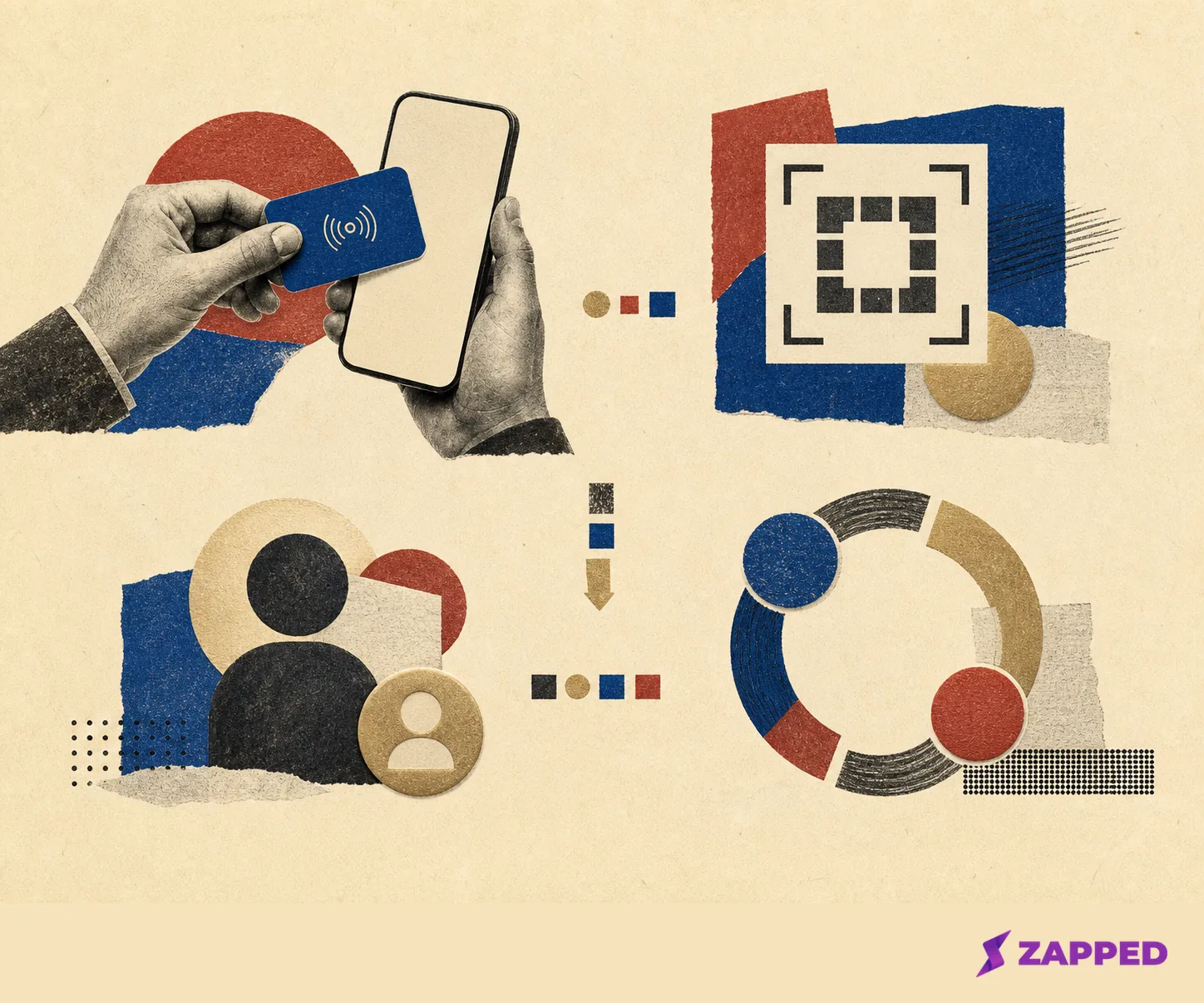
If a card only needs to pass along a name and contact details, a public vCard or profile is enough. If the owner needs to capture a lead, continue the conversation after an event, see which networking moments worked, or route contacts into a CRM, analytics and capture features can justify the subscription. For a team, shared templates, roles, workspaces, bulk ordering, and brand control matter more than another decorative finish.
Blinq's Business feature set shows what that higher capability level looks like: lead capture and enrichment, event campaigns and attribution, CRM integrations, team card management, brand controls, and team analytics. The r/NFC discussion gives the same practical warning from another angle. A commenter describes free options for a 12 person team as lacking analytics, team management, or looking poor with watermarks, and reports a $7 per month paid option.
Tap Tag's catalog shows that a physical product page can advertise digital profiles, review capture, team functions, and bulk ordering beside the material choices. The checked catalog gives the physical prices and capability paths, but it doesn't state a subscription term or what happens to a digital profile after a subscription ends. Ask directly before buying. A cheap card isn't a cheap system if the destination policy is a blank space.
The Android test that saves the whole idea
Don't wait until a meeting to discover that the tap opens the wrong profile.
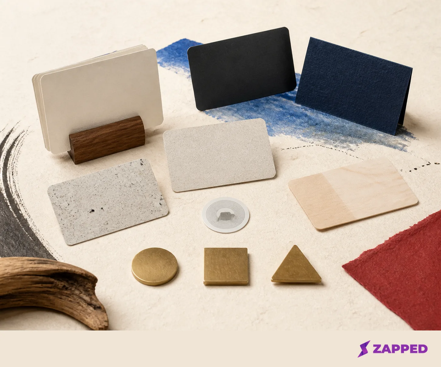
Start with the public destination. Write that URL with an NFC writing app, read it back, and confirm that it opens the intended page. Then use another compatible phone to test the tap, browser, and contact save flow. A second phone matters because you already know what the destination should do. The recipient doesn't.
Keep the QR code visible enough to scan without explaining it. Blinq recommends a QR fallback for phones without NFC, and its example accounts for different tap areas on iPhone and Android. The QR isn't an admission that the NFC idea failed. It's what lets the conversation continue when a phone, case, setting, or reader position gets in the way.
Zapped's NFC programming guide follows the same practical path: create and test the public card link, write the URL, test with another compatible phone, keep a QR fallback, and rewrite the tag if the wrong profile opens. That last step is why a rewritable tag is valuable during setup. Fix the destination before the card becomes someone's first impression.
The example that earns the next tap
The physical route depends on the conversation you need to start. PVC or specialty print works when the card must feel familiar and the design needs room to carry the brand. Metal or wood works when the physical object is part of the introduction and you're willing to respect its layout constraints. Vendor assisted artwork earns its place when proofing is worth more than total control. A maker template fits a small, inexpensive build when you're willing to own every physical test.
The digital decision follows. Free sharing is enough for a simple personal profile. Contact capture, analytics, team management, bulk ordering, and brand control are reasons to pay when they're part of the workflow, not because a pricing page has more boxes.
We'd start with a changeable browser destination and a QR fallback, then let the event argue for premium hardware. Skip the metal statement if the tag area, QR placement, or destination policy is still uncertain. The card is finished only when it still works after the first tap, once the design has stopped doing the talking.