Modern business card design is not about adding more effects. It is about making your name, role, offer, and next step easy to notice in a few seconds.
Quick answer
A modern business card stands out when it combines clear hierarchy, a memorable visual detail, and a simple action path. Use strong spacing, readable type, one main call to action, and a QR or NFC link to a page you can update later.
Key takeaways
- Prioritize readability before texture, color, or novelty.
- Use one main action, such as book, save contact, view portfolio, or request a quote.
- A QR code works best when it points to a live profile, not a static PDF.
- Keep print design and digital follow-up consistent.
What to decide first
Start with where the card will be used. A counter card, event card, packaging insert, and premium meeting card all need different layouts. Decide the main action first, then choose the format, finish, QR placement, and amount of detail.
| Choice | Best for | Watch out for |
|---|---|---|
| Minimal card | Consultants, executives, service providers | Can feel generic without one strong detail |
| Photo or product card | Creators, real estate, food, beauty | Can look cluttered if text competes with the image |
| QR first card | Events, teams, sales reps | Needs a clear reason to scan |
| NFC enabled card | Premium networking and repeat use | Needs a digital profile behind the tap |
What to include
A business card should give people enough context to remember you and enough direction to act. It does not need to carry every detail. The linked profile, QR destination, or follow-up page can hold the longer information.
Useful elements include:
- Name, business name, role, phone, email, and website or profile link.
- One short line that explains what you do or who you help.
- A QR code when the next action is easier on a phone.
- Strong spacing, readable contrast, and a safe margin around important details.
- A finish or material choice that matches the brand without hurting readability.
How to make the card more useful after the handoff
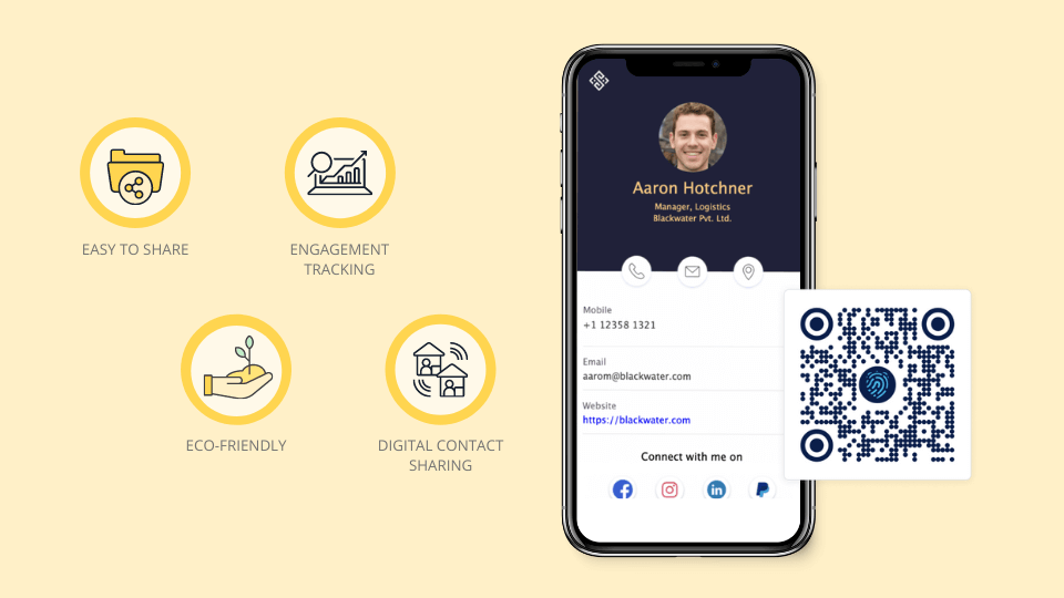
The card should create a memory and a next step. Add a profile link when you need a portfolio, booking page, gallery, menu, review request, quote form, or seasonal offer. That lets the printed card stay clean while the digital destination does the heavier work.
How to make it work in the real world
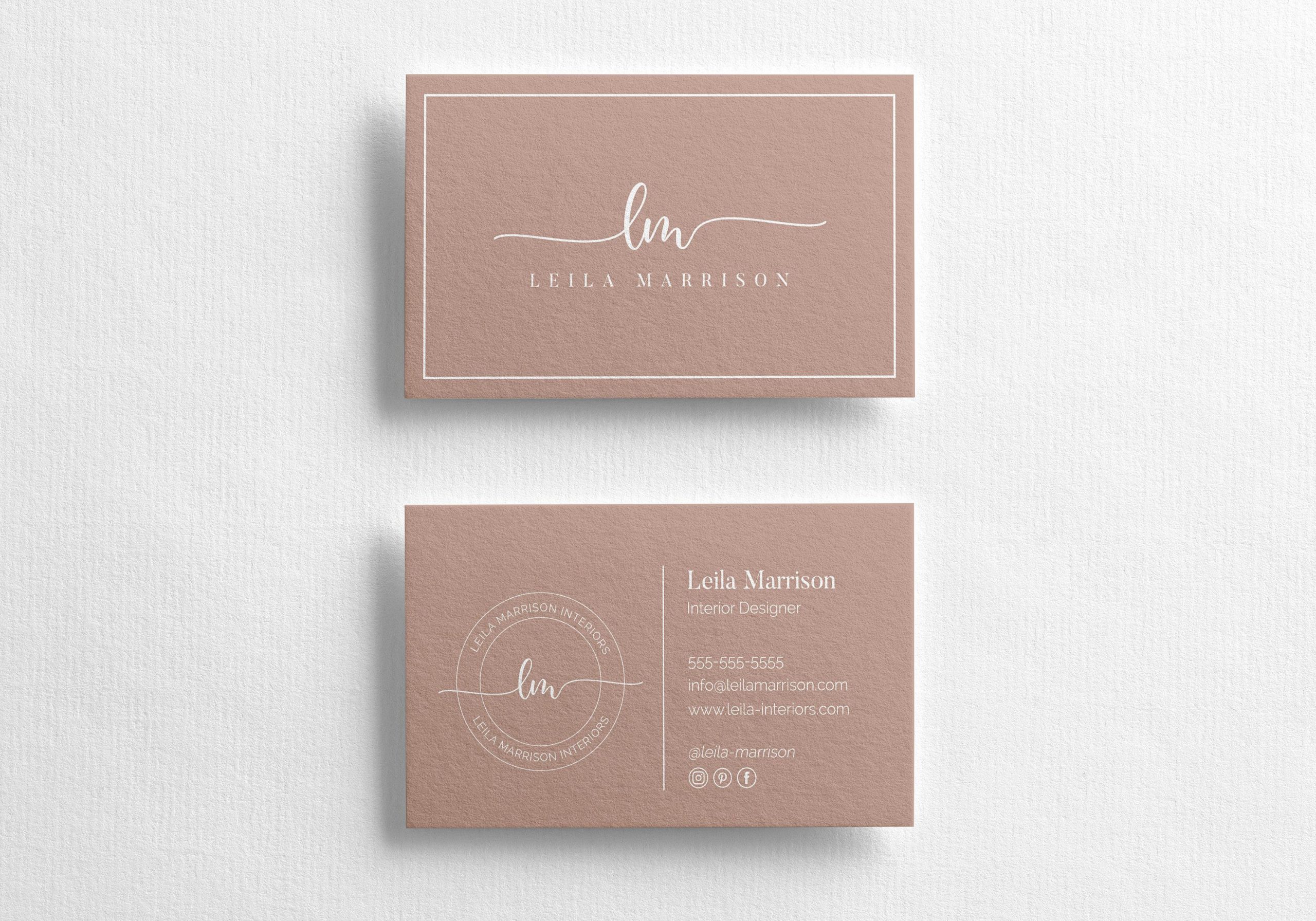
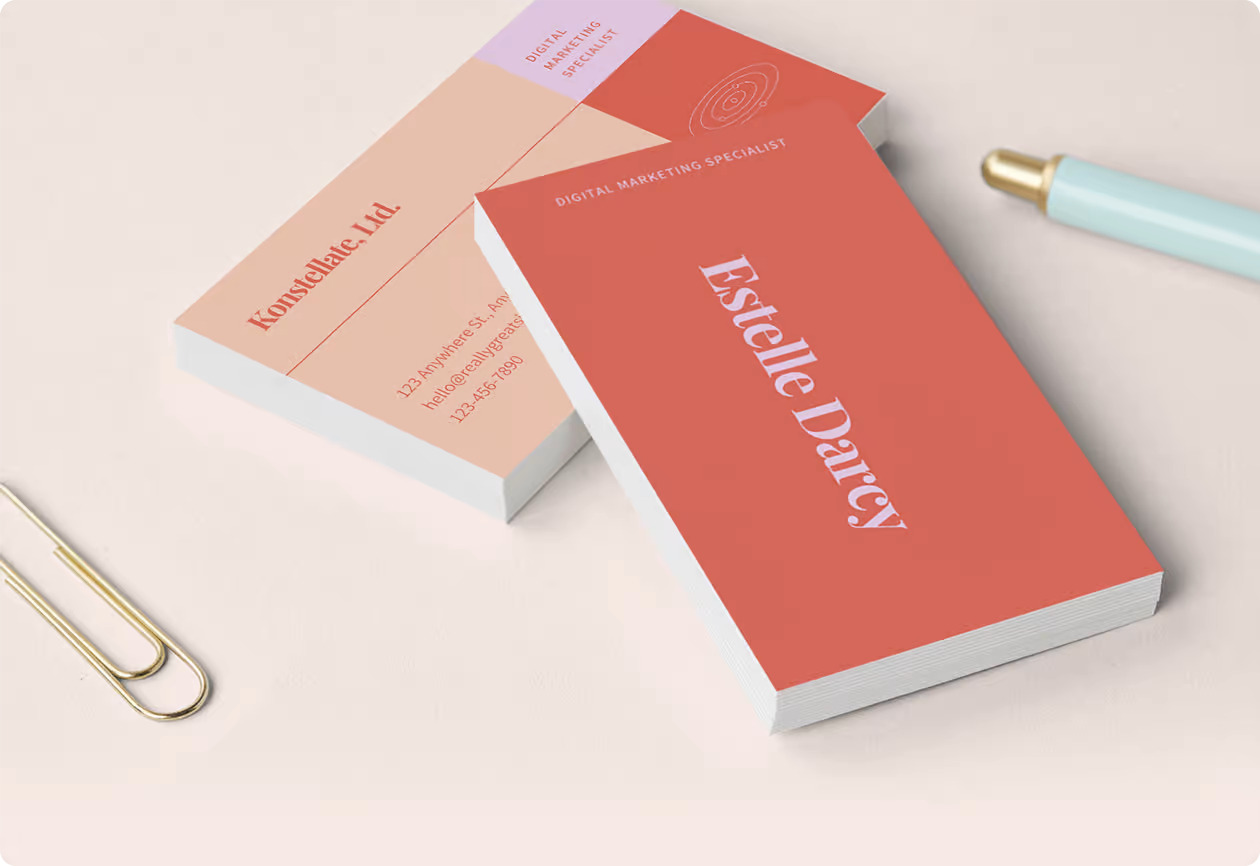
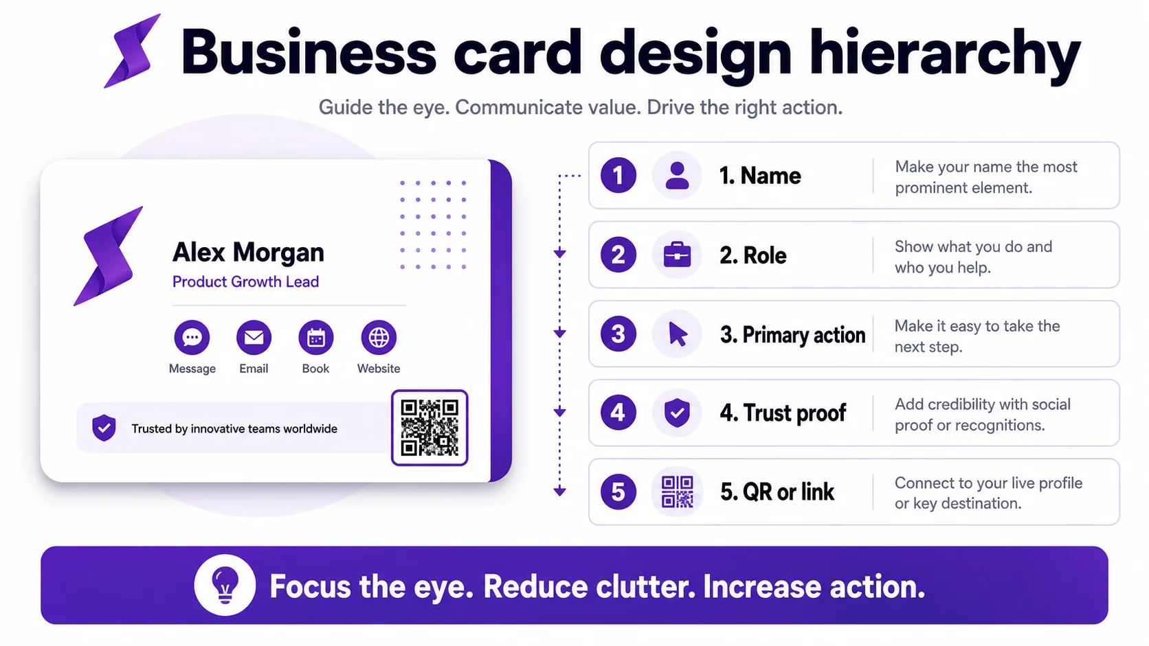
Use contrast, spacing, and hierarchy before adding decoration. Put the name and role first, keep contact details compact, and make the QR code large enough to scan. If the card has a premium finish, let that finish support the message rather than carrying the whole design.
This visual shows how the printed design can point attention toward the action you want the person to take.
Practical examples
- A realtor uses a photo, short specialty line, and QR code to open active listings.
- A consultant uses a clean card with one strong headline and a booking link.
- A photographer uses one image on the front and a portfolio QR on the back.
- A trade show team uses consistent branded cards that point to individual profiles.
Layout examples that work
For modern business card designs that stand out, choose a layout based on the handoff moment. A desk or counter card can be bolder because people have time to look at it. An event card should be faster to read because the exchange is brief. A packaging insert can include a thank-you message and review prompt. A premium meeting card can use more white space and a single high-value next step.
Strong layouts usually share a few habits:
- The name or business name is readable at a glance.
- The specialty or offer is specific enough to remember.
- The QR code has enough space around it to scan reliably.
- The back of the card is used for a useful prompt, not filler.
- The linked page continues the same promise as the printed card.
Troubleshooting weak card performance
If people keep taking cards but not contacting you, the problem may be the next step. Test a stronger call to action, add a QR profile, simplify the copy, or move the most useful contact path higher. If people scan but do not act, improve the mobile profile before redesigning the printed card.
Common mistakes to avoid
Avoid tiny type, too many icons, low contrast, untested QR codes, and slogans that do not tell people what you do. Do not print a link that you cannot update later.
Where Zapped fits
Zapped works well behind modern cards because the card can stay simple while the profile carries everything else: contact buttons, booking, social links, files, payments, videos, and analytics. That means the printed design can be elegant without becoming a cramped brochure.
Before you publish or print
- Print a test card and scan the QR code from normal hand distance.
- Check the card in daylight and indoor event lighting.
- Use one profile URL on the card so future updates do not require a reprint.
- Keep the same photo, logo, and offer on the linked profile.
FAQs
What makes a modern business card design effective?
It is effective when the design makes the next action obvious, keeps the contact details readable, and gives people one live destination for updates.
Should I add a QR code?
Yes, if the QR code sends people to a useful page. Test the code before printing and keep enough white space around it.
Do I still need a printed card?
Printed cards still help in face-to-face moments. They work best when paired with a digital profile that can change after the card is printed.
How often should I update the linked profile?
Update it whenever your offer, booking link, phone number, portfolio, menu, or lead form changes.
Sources
- MOO business card design guidance for print format and finish considerations.
- VistaPrint business cards for current online print-ordering context.
- Zapped digital business card features for QR, NFC, and editable profile workflows that extend a printed card.