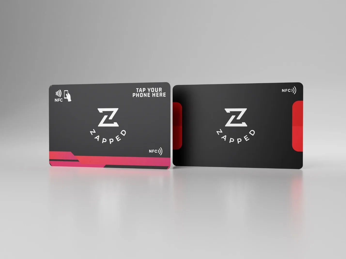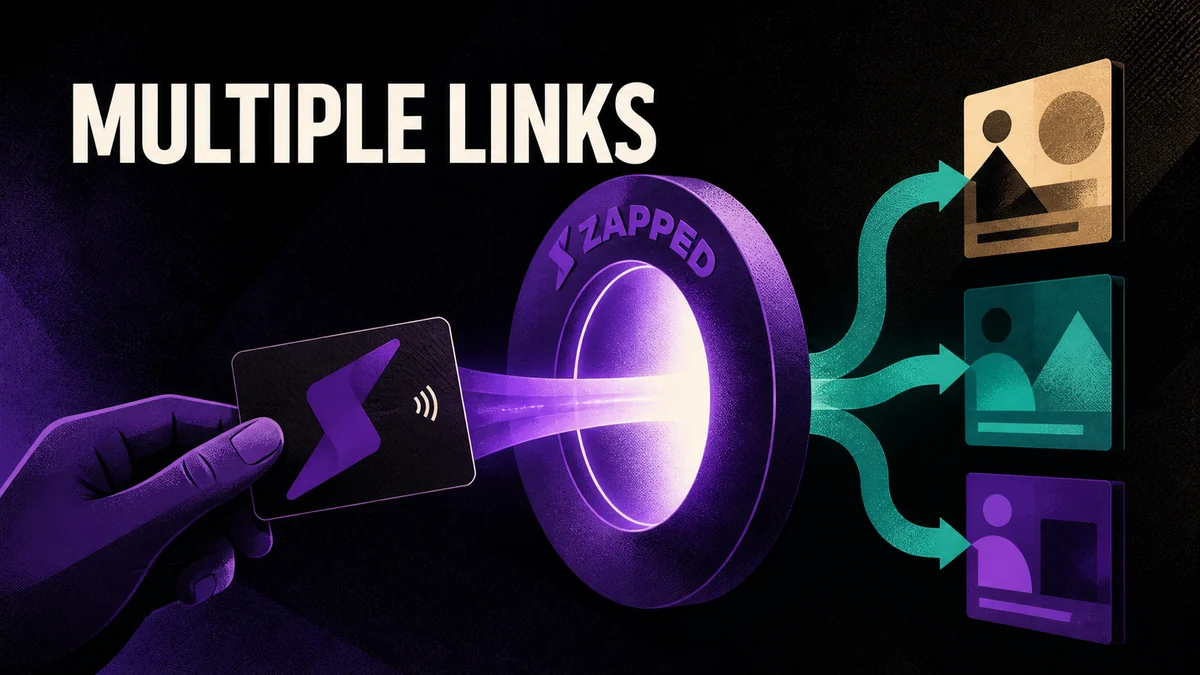
You can't write five links to one NFC tag and expect a phone to ask the reader which one they meant. The tap opens one thing. So the way to put multiple links on an NFC business card is to point the tap at one stable public URL and let the page behind it hold the choices.
That's not a workaround; it's the better design. The handoff stays fixed, the page stays editable, and you shape the choices around the meeting instead of reprogramming the card every time a destination changes.
The short answer: one public URL, several destinations
Point the NFC handoff at one stable public URL. Let that URL open a profile or landing page with several useful destinations, and skip the page entirely when the reader has one obvious job, sending them straight to that destination instead.
Keep the handoff fixed and the page flexible. The card is the doorway. The page is the room, and you can rearrange a room without moving the door.
The route has a fixed handoff and an editable page
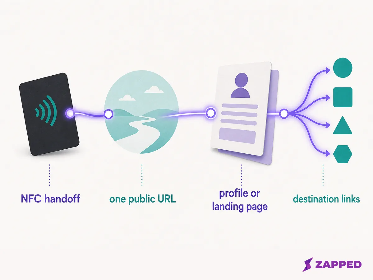
Think of the setup as four layers: the NFC handoff, the public URL, the profile or landing page, and the destination links. The handoff opens the URL. The page decides what the visitor sees next.
This separation gives the page a real job. It can hold contact details, a booking action, a portfolio, or a relevant social destination without turning the card into a menu of unrelated choices. And when your work changes, you edit the page once; every card you've ever handed out updates with it.
One address rule worth tattooing somewhere: keep the public card URL separate from the address you use to edit the page. The public address is for the handoff and for people you meet. The editor or dashboard address is for you, and it should never leave your hands.
Build the link set around one primary action
Start with the next step you most want a new contact to take. Then add only destinations that help that step make sense.
- Identity and contact details, so the reader knows who owns the page.
- One primary action, such as booking, calling, visiting a portfolio, or starting a conversation.
- Proof that supports the meeting, such as selected work or a focused service page.
- One social or booking route when it adds context. Leave it out when it only creates another place to look.
Links earn their place when they answer different reader needs. They become clutter when they all compete for the first click. A page with nine equally weighted links isn't generous; it's homework, and most readers won't do it.
Make the first click obvious
Order the page for someone who met you four minutes ago and has very little context. Name and role first, the primary action easy to spot, supporting contact details and proof below it.
Then match the order to the conversation. A booking focused meeting may need the booking action near the top. A conversation that starts with your work may need the portfolio first. The profile earns its keep when the reader doesn't have to guess which link matters.
Keep the public page useful after the card is handed out
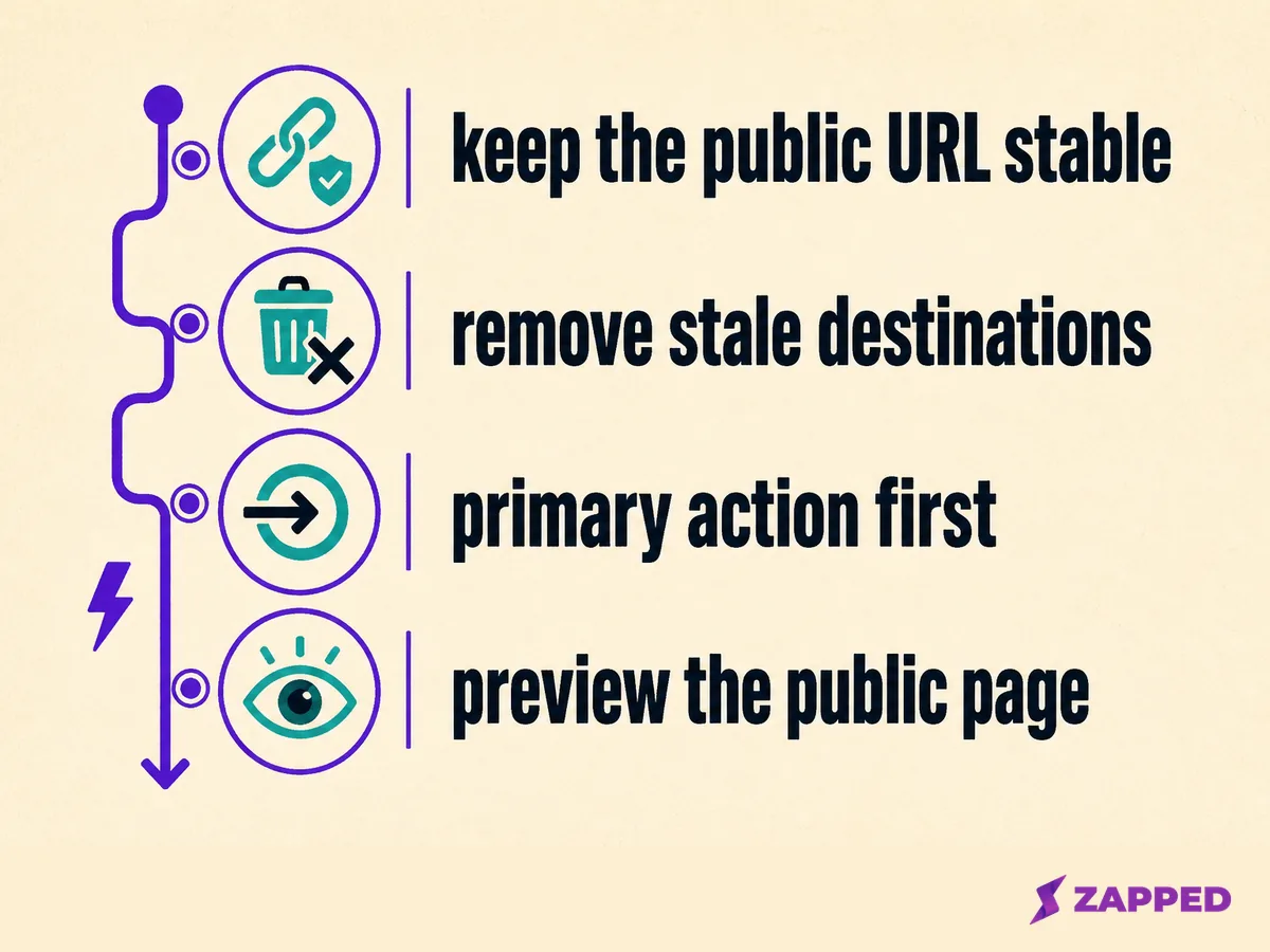
Review the destination set whenever your work changes. Keep the public URL stable, remove stale links, keep the primary action first, and open the public page after edits so you see what a new contact will see.
Zapped’s vCard guide describes a digital card that can hold contact details, links, a profile image, and practical next actions.
Its NFC programming guide says to write the public card URL, not an editor or dashboard address.
That same guide’s update note says Zapped content changes appear when the public URL opens, so treat this maintainability point as specific to Zapped’s documented workflow.
If the physical handoff benefits from a second route, show a QR code or print the public URL beside the NFC cue. That gives the reader another way to reach the same page without changing the page’s job.
Zapped states that its card can open from a QR code, NFC tap, or link in a normal browser on its homepage, which also describes sharing from a scan, tap, link, email signature, event table, or social profile.
Use a direct destination for one job
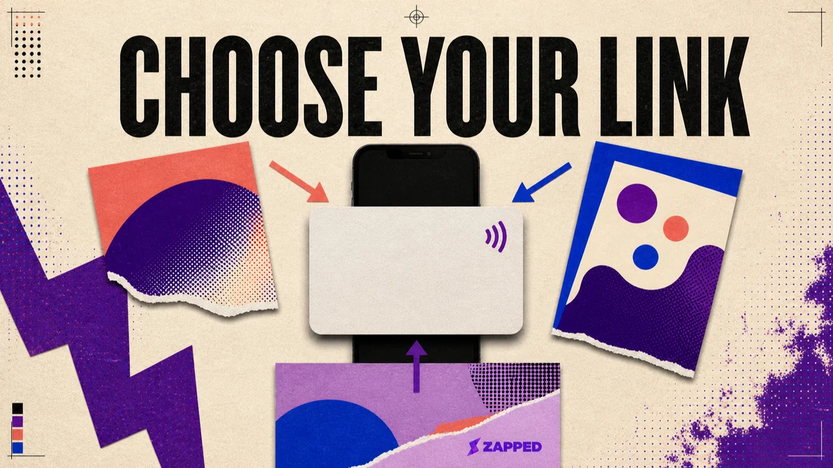
The profile layer isn't mandatory. When the audience, task, or timing is singular, one appointment page, one event registration, one focused offer, a direct destination is often the clearer handoff, and the page would only slow the reader down.
The test is simple: if removing every link except one makes the handoff clearer, use the direct route. If the reader genuinely needs to choose, keep the page layer and make the first action unmistakable.
Make the route decision, then program it
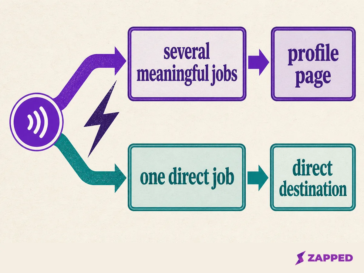
We'd decide it in one sentence: does this reader need a room, or a door straight to the thing? Several meaningful destinations justify the page layer. One obvious job favors the direct destination. Once the public URL is chosen, the guide to programming NFC business cards covers the separate job of writing it to the card.
The durable rule is to keep the carrier route stable and the destination set deliberate. The card starts the handoff. The public page does the explaining, and it's the only part that should ever need to change.
Sources
- Zapped, “Create your first vCard,” reviewed in August 2026: https://zapped.to/help/creating-your-first-vcard
- Zapped, “Program an NFC business card,” reviewed in August 2026: https://zapped.to/help/how-to-program-nfc-business-cards