A digital business card design needs to look good on a phone first. The best layouts use clear hierarchy, strong contact actions, and just enough branding to feel professional.
Quick answer
Design the card around the recipient. Put the name, role, company, main action, and save contact option first. Keep secondary links organized so the profile feels useful, not crowded.
Key takeaways
- Use a live profile as the source of truth.
- Add QR sharing because it works across more devices.
- Add NFC when in person sharing is part of your workflow.
- Keep the main action clear so people know what to do next.
- Use Zapped where an editable profile, QR, NFC, and team controls belong in one place.

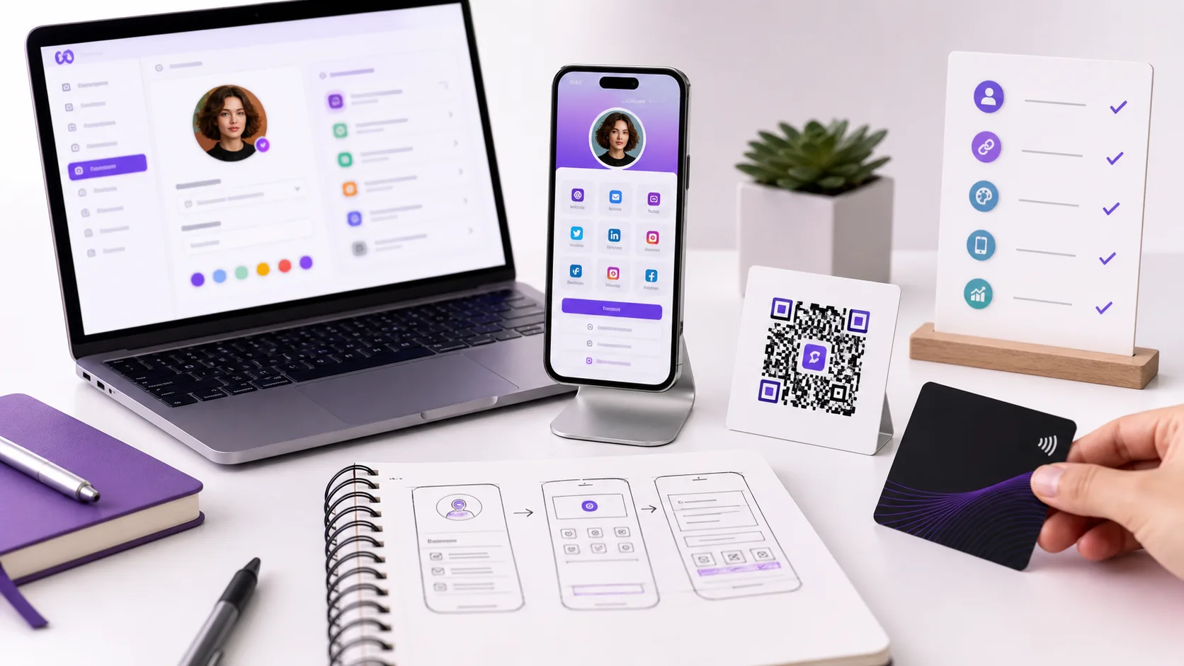
Use this image as a reference point while you compare the options below. The important idea is that the card, code, or NFC tap should lead to a profile that is easy to save and act on.
Best options by use case
| Design element | Best practice | Why |
|---|---|---|
| Name and role | Make them visible first | People need context quickly |
| Primary CTA | Use one main action | Reduces decision friction |
| Contact buttons | Call, email, save, message | Turns interest into action |
| Links | Group by purpose | Prevents clutter |
| QR and NFC backup | Use both when printed | Improves compatibility |
Design mistakes to avoid
Do not lead with decoration before identity. Do not bury the save contact action. Do not use tiny QR codes. Do not add so many links that the profile loses focus.
If the card will be printed, test the QR code at the final size and under normal lighting.
What to include
A strong digital business card usually includes:
- Name, role, and company.
- Phone, email, and website.
- A save contact action.
- One primary call to action.
- QR code or direct sharing link.
- NFC support when useful.
- Social, portfolio, booking, payment, or review links when they help.
Simple setup checklist
- Create the live profile.
- Add your essential contact fields.
- Choose one primary action.
- Generate and test the QR code.
- Add NFC or Wallet sharing if the use case needs it.
- Test the experience on iPhone and Android.
- Update the profile whenever your details change.
Mobile first layout order
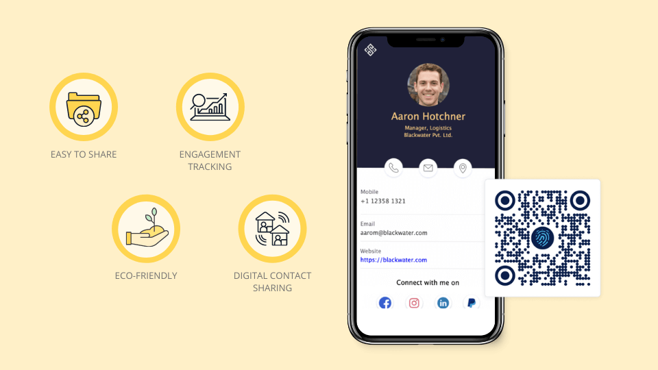
The top of the card should answer three questions fast: who are you, why should I care, and what should I do next? Put the primary action near the top, then group secondary links below it.
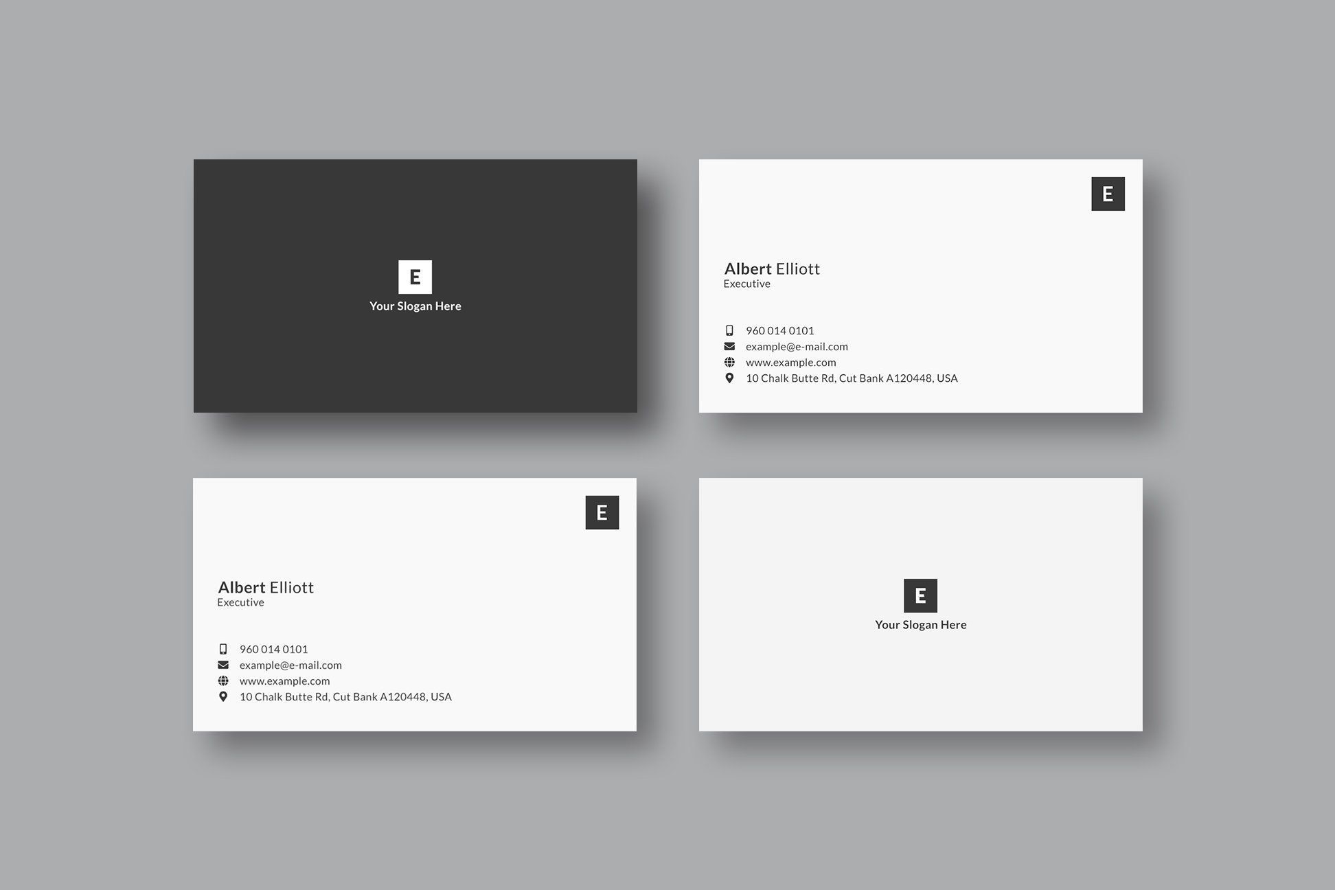
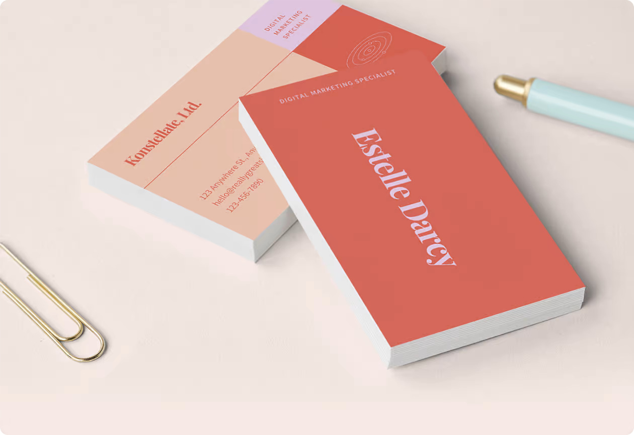
For printed cards, the same hierarchy matters. The name, role, QR code, and one short instruction should be readable without crowding the design.
Design review checklist
Check contrast, button size, link labels, QR size, image cropping, and the save contact flow. If any part feels unclear on a phone, simplify before publishing.
Design elements that affect conversions
Design searches are not only about colors and fonts. For a digital card, design should help the recipient recognize you, trust the page, and choose the next action.
Focus on:
- A clear photo or logo.
- High contrast text.
- One primary button near the top.
- A short role or value statement.
- Contact options that match how people actually reach you.
- Enough spacing for mobile tapping.
- A QR code that is large enough to scan.
If the card looks beautiful but the save contact action is buried, the design is not doing its job.
Visual hierarchy checklist
A digital card should guide the eye in a predictable order. The reader should see who you are, what you do, why they should trust you, and what to tap next.
Check the mobile page in this order:
- Name and photo.
- Role and company.
- Primary action.
- Contact options.
- Proof or helpful links.
- Secondary social links.
If social icons appear before the main action, the card may send attention away too early.
Design the card around the Zapped destination
The best digital card design makes the next action obvious. Zapped gives the design a live destination, so the visual card can stay focused while the profile carries contact details, links, booking, social profiles, and updates.
That keeps the card from becoming cluttered and lets you improve the profile after launch without redesigning every QR code, NFC card, or shared link.
FAQs
What is the best digital business card format?
The best format is usually a live web profile with a QR code, direct link, and optional NFC card. That gives people more than one way to open the same profile.
Do people need an app to view my digital business card?
Usually no. A web based profile should open in a normal browser. Apps can help the card owner manage the profile, but the recipient should not need to install anything just to view your details.
Should I use NFC or QR for how to design a digital business card that converts?
Use both when the card will be shared in person. NFC feels fast when someone knows where to tap, and QR gives a visible backup for any phone with a camera.
Can I update the card after sharing it?
Yes, if the QR code, NFC tag, or shared link points to an editable profile. That is one of the biggest advantages over a static printed card.
Where does Zapped fit?
Zapped is a good fit when you want one editable digital card profile that can be shared by link, QR code, NFC card, and team workflows without rebuilding the card every time details change.
Sources
- VistaPrint, business card layout tips: Used for business card layout and print design context.
- Apple Support, scan a QR code with iPhone camera: Used for iPhone QR scanning behavior.
- Android, how to scan QR codes on Android: Used for Android QR scanning behavior.