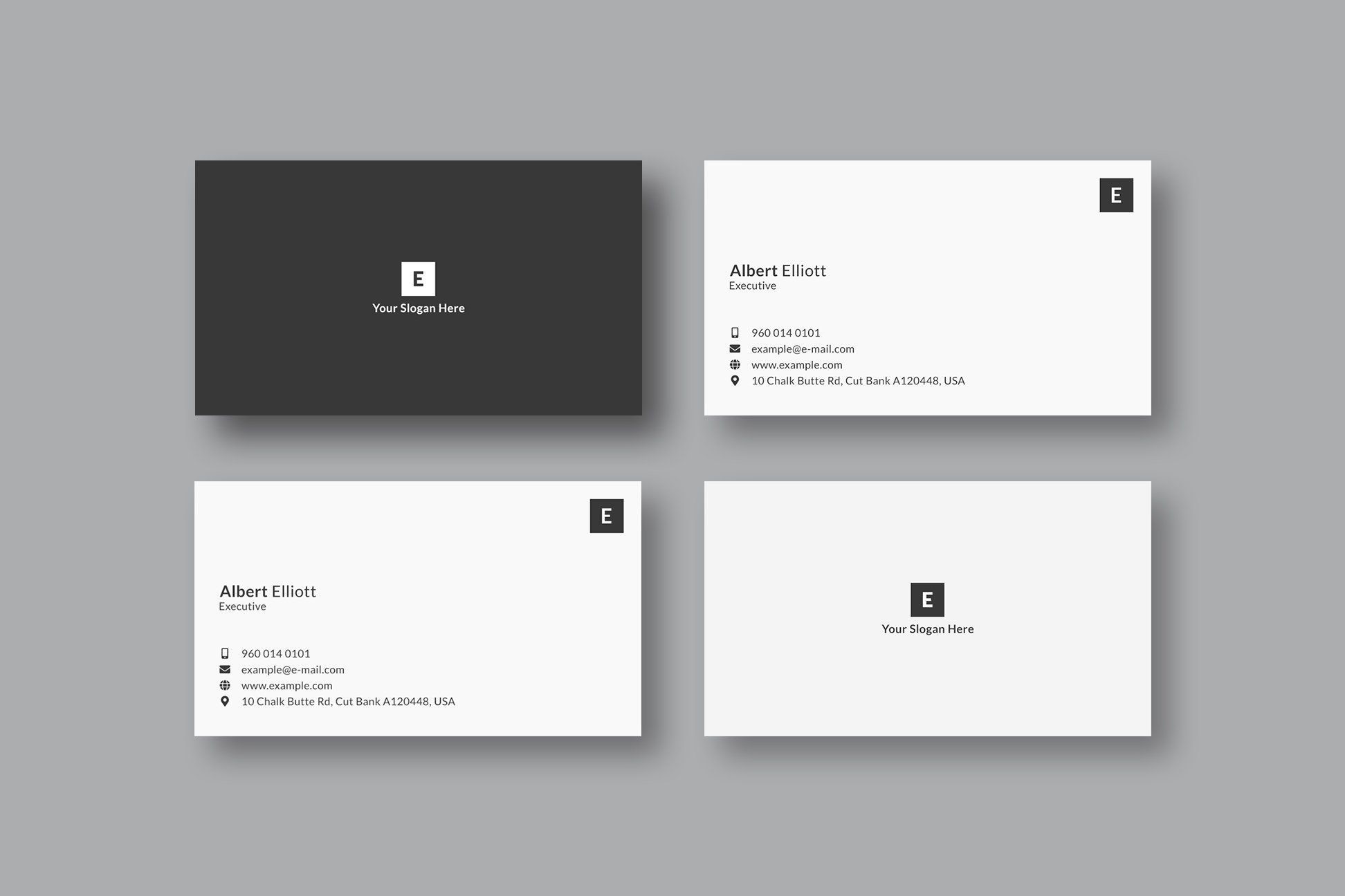
A minimalist business card should make your name, role, company, and next step easy to understand in a few seconds. The best designs look simple because every element has a job, not because important information was removed.
Quick answer
A good minimalist business card uses a simple layout, clear typography, generous white space, one strong brand cue, and only the contact details someone actually needs. For modern networking, pair the physical card with a QR code, NFC tap, or Zapped digital business card so the printed design can stay clean while the full profile stays easy to update.
Key takeaways
- Minimalist business cards work best when the hierarchy is obvious at a glance.
- White space should guide attention, not make the card feel empty or unfinished.
- One or two colors are usually enough if typography, spacing, and logo placement are strong.
- Keep print details inside the safe area so names, QR codes, and contact details are not trimmed.
- Use a digital card link when you need more details than a minimalist printed card can comfortably hold.
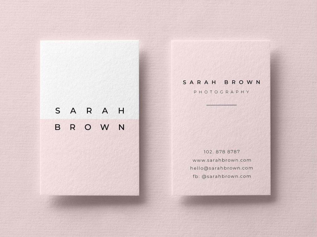
What is minimalist business card design?
Minimalist business card design is a restrained card style that uses fewer visual elements so the most important information is easier to see. It usually relies on clean type, strong spacing, a limited color palette, and a clear focal point.
Minimal does not have to mean plain. A card can still feel premium, warm, creative, or bold. The difference is that the design avoids extra icons, textures, taglines, photos, and decorative effects unless they support the card's main purpose.
For most people, the main purpose is simple: help someone remember you and take the next step.
What should a minimalist business card include?
A minimalist card should include only the details that help a new contact identify you and reach you. If a detail is useful but makes the card crowded, move it to a digital profile and link to it with a QR code or NFC card.
| Element | Keep on the card? | Minimalist rule |
|---|---|---|
| Name | Yes | Make it the clearest text on the card |
| Role or specialty | Usually | Keep it short and specific |
| Company or logo | Usually | Use one strong brand mark, not several |
| Phone or email | Usually | Choose the best contact method, not every method |
| Website or digital card URL | Yes | Use a short URL, QR code, or NFC tap |
| Social handles | Sometimes | Add only the channel that matters for sales or trust |
| Address | Only if needed | Skip it for remote, mobile, or service area businesses |
| Long tagline | Usually no | Save it for the digital card or website |
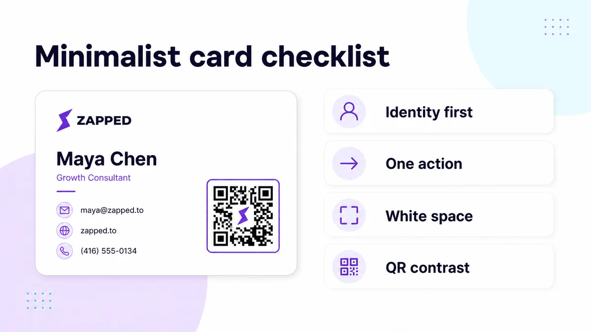
Use this layout checklist before you remove another detail from the card. The goal is not to make the design empty. The goal is to make identity, action, spacing, and scan reliability feel effortless.
How do you make a minimalist business card look professional?
Start with hierarchy. Decide what someone should notice first, second, and third, then make the design support that order. A clean card fails when every line has the same size, weight, and spacing.
Use this simple order:
- Name or brand.
- Role, specialty, or company.
- Best contact method.
- Website, QR code, NFC prompt, or digital card link.
After the hierarchy is clear, remove anything that competes with it. Nielsen Norman Group's minimalist design guidance is useful here: unnecessary information competes with the information people actually need.
Minimalist business card design ideas
Minimalist design gives you several directions. Pick the one that fits your brand instead of copying whatever looks trendy.
| Style | Best for | How to make it work |
|---|---|---|
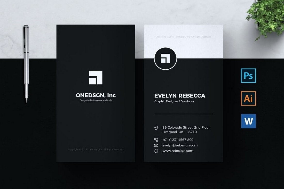
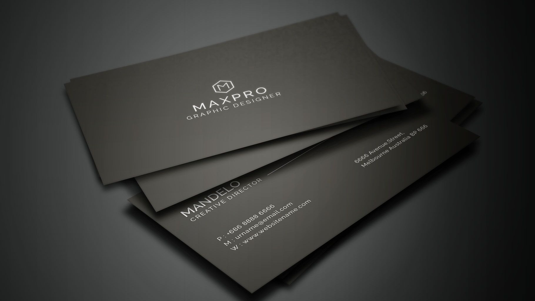
| Black and white | Consultants, attorneys, finance, B2B services | Use contrast, strong type, and careful spacing |
| One accent color | Coaches, creators, realtors, service brands | Let one brand color guide the eye to the name or QR code |
| Type only | Designers, writers, strategists, personal brands | Make the typeface and layout do the personality work |
| Logo first | Established companies and teams | Give the logo room and keep contact details secondary |
| QR or NFC focused | Events, sales, recruiting, teams | Keep the printed card sparse and put deeper info online |
| Premium material | Luxury, hospitality, beauty, boutique services | Use paper stock, texture, foil, or embossing instead of visual clutter |
Formal exchange cultures often push the same restraint further, so Japanese business card ideas are worth studying when bilingual layout and respectful hierarchy matter as much as white space.
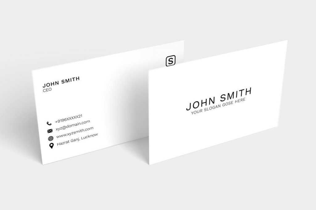
How much white space is enough?
White space is enough when the card feels easy to scan and nothing important looks cramped. It is too much when the card feels unfinished, disconnected, or hard to understand.
Use white space to group related details. Your name and role can sit together. Contact details can sit together. A QR code or logo can sit in its own quiet area. That structure makes a simple design feel intentional.
Good minimalist spacing should help with:
- Readability from arm's length.
- Faster scanning at events.
- Clear separation between identity, contact details, and action.
- Better QR code scanning because the code has enough quiet space around it.
What print details matter for minimalist cards?
Minimalist cards leave more visible room for print mistakes, so setup matters. Use the printer's template when possible and keep important text, logos, and QR codes inside the safe area.
For a standard US business card, many printers use a trimmed size of 3.5 x 2 inches. VistaPrint lists a full bleed size of 3.61 x 2.11 inches and a safe printing area of 3.36 x 1.86 inches. MOO gives similar safe area guidance and warns that important text and logos should stay inside the safe area.
Before sending a card to print:
- Use the correct size for your printer.
- Extend background color or artwork into the bleed.
- Keep text, logos, and QR codes inside the safe area.
- Export at print quality.
- Print a paper proof or test copy before ordering a large batch.
- Scan the QR code from the proof, not only from the screen.
Should minimalist cards be physical, digital, or both?
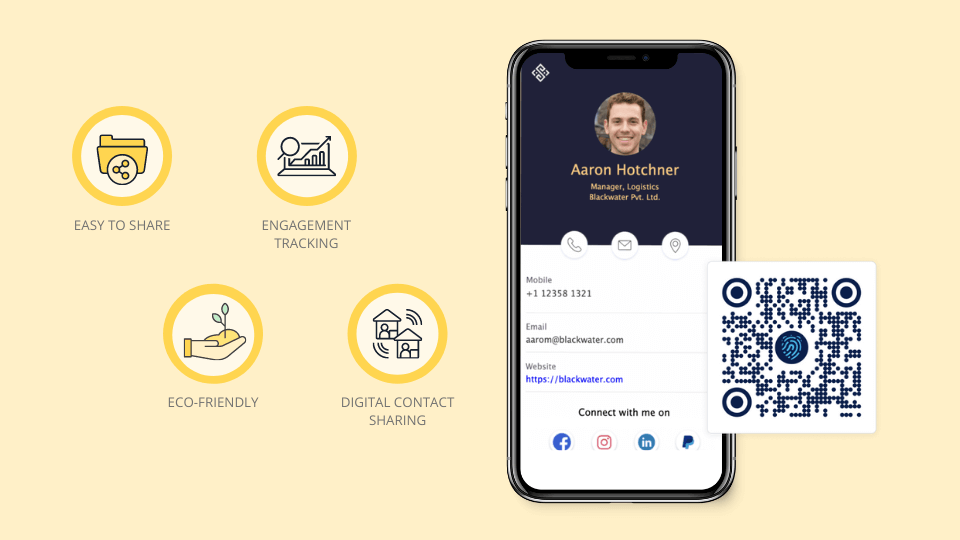
Use both when you want a clean first impression and an easy follow up. A physical minimalist card is great for handoffs. A digital business card is better for saving contact details, updating links, adding media, and tracking engagement.
That combination solves the biggest minimalist-card problem: there is not much room on a small piece of paper. With Zapped, the card can stay simple while the digital profile holds your full contact details, booking link, social profiles, payment links, media, and team information.
For example:
- A consultant can print only their name, title, email, and QR code.
- A realtor can use a clean NFC card that opens a profile with listings and contact options.
- A team can keep a consistent minimalist card style while each member manages their own digital profile.
You can also compare related options in our guides to digital business card ideas, modern business card designs, and whether business cards are still relevant.
Minimalist business card mistakes to avoid
Minimalism works when it creates clarity. It fails when it removes too much context or makes the design feel generic.
Avoid these common mistakes:
- Making the name, title, and contact details too small.
- Using a light gray font that looks elegant on screen but weak in print.
- Adding a QR code without enough empty space around it.
- Using a logo without enough contrast.
- Removing the role or specialty, which makes the card harder to remember later.
- Putting every social profile on the card instead of linking to one digital profile.
- Choosing style over scannability, especially for cards used at events.
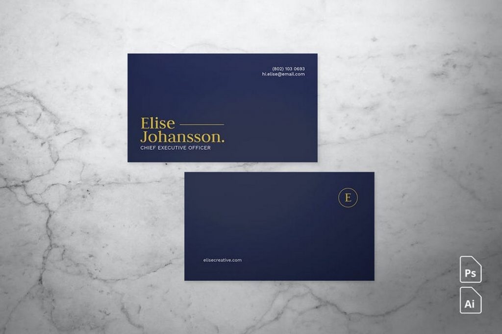
Quick minimalist card checklist
Before you approve the design, check the card like a new contact would.
- Can you read the name in two seconds?
- Is the role or company clear without explanation?
- Is there one obvious next step?
- Does the QR code scan from the printed proof?
- Are all important details inside the safe area?
- Does the design still work in black and white?
- Does the card match the website, email signature, and digital card?
- Is anything on the card there only because there was empty space?
If the answer to the last question is yes, remove it or move it to the digital profile.
Keep the printed card minimal with Zapped
Minimalist cards work best when the printed design does not have to carry everything. Zapped lets the card use one QR code, NFC tap, or short link while the profile carries contact details, booking, website, social links, and follow up actions.
That protects the clean design and keeps the card useful after details change. The printed card stays quiet, while the profile does the practical work.
FAQs
What makes a business card minimalist?
A minimalist business card uses fewer design elements so the important details are easier to read. It usually has a limited color palette, clean typography, intentional white space, and a short set of contact details.
Are minimalist business cards still effective?
Yes, minimalist business cards are effective when they are readable, memorable, and easy to act on. They work especially well when paired with a QR code, NFC tap, or digital business card that carries the details the printed card leaves out.
What colors work best for minimalist business cards?
Black, white, gray, and one brand accent color are the safest starting points. The best choice depends on your brand, but the card should have enough contrast for easy reading in real world lighting.
Should I put a QR code on a minimalist business card?
Yes, if the QR code leads to something useful, such as a digital business card, booking page, portfolio, or lead form. Keep enough space around the code and test it from a printed proof before ordering cards.
How do I make a minimalist card less boring?
Use better hierarchy, spacing, materials, or one memorable brand detail instead of adding more decoration. A card can feel distinctive with strong typography, an unusual layout, textured paper, a sharp logo placement, or a clean NFC call to action.
Sources
This guide uses current design and printing guidance from usability and business card printing resources.
- Nielsen Norman Group, aesthetic and minimalist design: Used for the principle that unnecessary information competes with important information.
- Nielsen Norman Group, whitespace: Used for white space guidance around scanning and readability.
- VistaPrint, business card layout tips: Used for business card layout factors such as hierarchy, readability, colors, and visual impact.
- VistaPrint, business card dimensions: Used for standard US card size, bleed, and safe printing area context.
- MOO business card design guidelines: Used for safe area guidance and print template context.