The photo looks right in your camera roll. Then the card opens on a phone, your face becomes a tiny circle, and the only clear next step is buried below it. That is the test that matters.
Start with a sharp, square, centered headshot and inspect it in the card's real mobile preview. Keep your name, role, company, and main contact action as text. The photo should help someone recognize you, not carry your identity on its own.
Give the photo one job
A profile photo is for recognition. A cover graphic is for context. A company logo is for the company. When one image tries to do all three, a person looking for your face gets a text heavy banner instead.
Typecard's creator separates a Profile photo field from the rest of the card and says the uploaded image is ideally square. Popl also separates the profile picture, cover photo, and company logo fields in its card editor. The distinction matters because each field may receive a different shape or position.
Use a real headshot for the profile image. Do not use a logo because it fits the square better, and do not make a cover graphic double as your portrait. If the card needs both a face and a brand, give each one its own space.
Crop for the card, not the camera roll
Choose a square source with your face and shoulders near the middle. Popl recommends a 540 x 540 px headshot with high resolution, minimal noise, and a neutral background. It also warns that a photo that is too zoomed out or off center can look small or distorted.
The square file is only the starting frame. Your platform may show a circular crop, a narrower mobile layout, or an image area much smaller than the original. Leave enough room around the face for those changes, then inspect the result instead of trusting the source photo.
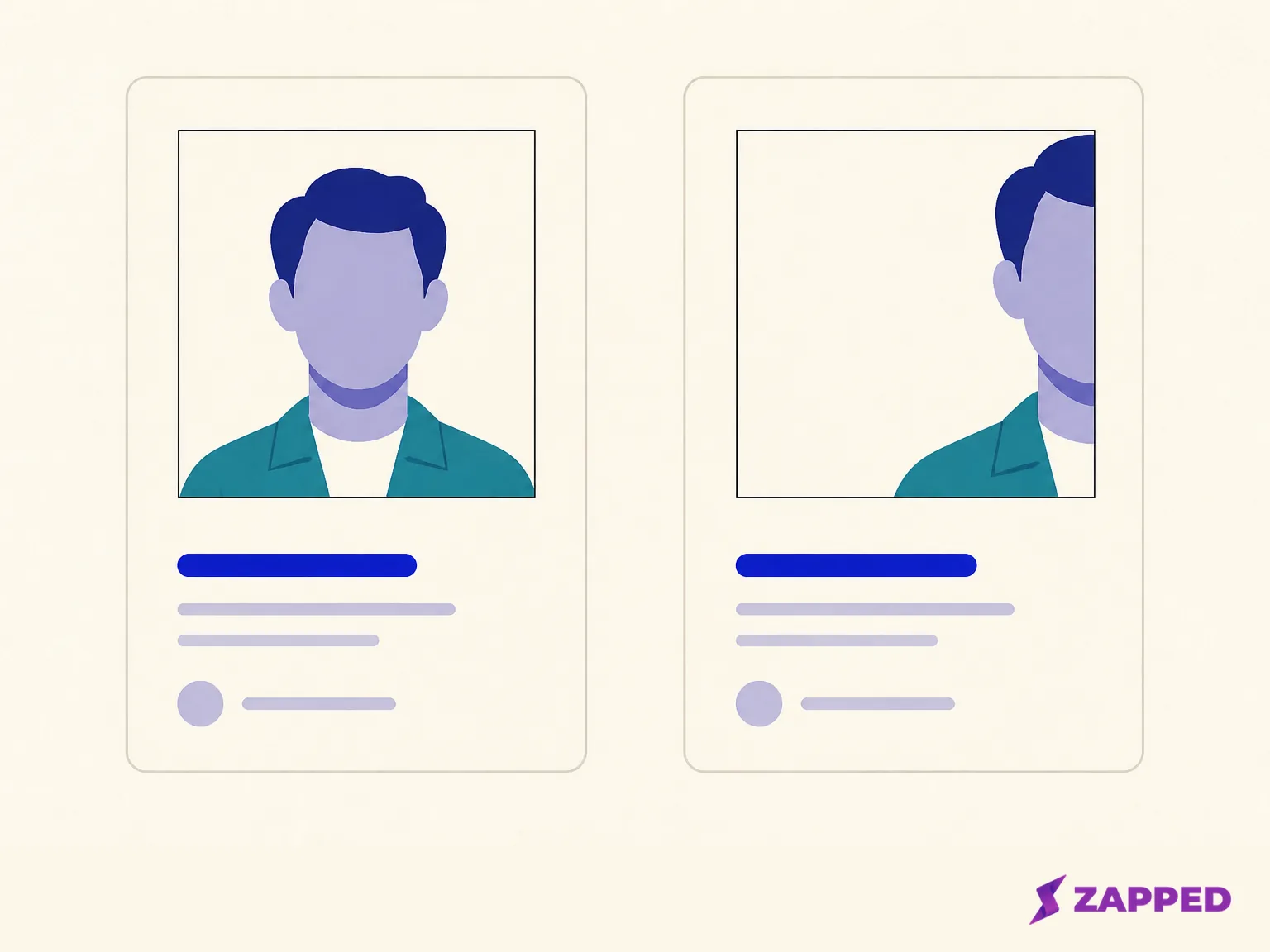
If the source is a landscape group shot, a distant full body photo, or a portrait with the face pressed against an edge, crop it before uploading. A clean crop is more useful than preserving every inch of the original. The picture does not need drama. It needs to keep you identifiable when the card gets small.
Keep it clear without making the card heavy
Use the sharpest sensible source, but do not assume the largest file is the best upload. Google notes that photo quality and page weight both matter. A blurry photo is less useful, while images can make up a large share of a page's size. On a phone, quality and delivery share the same budget.
Responsive image delivery lets the browser choose a suitable resource for the device. web.dev's responsive image guidance notes that sending desktop sized images to mobile devices can use two to four times more data than needed. That does not give you a magic file size. Use a clear source, let the platform optimize it when it supports responsive delivery, and check the public card on the phone your contacts are likely to use.
The practical test is quick. Does the face stay clear at the size the card uses? Does the profile appear promptly enough for a visitor to see your name and action without waiting on a giant image? If not, reduce the image sensibly or leave it out while you fix the card.
Let the text introduce you
The photo helps someone recognize the person they met. Text tells them whether they found the right person and what to do next. Keep the person's name, role, company, a direct contact action, and one useful link as real text near the image.
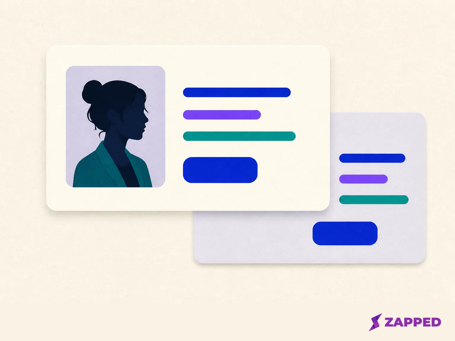
Zapped's setup guidance puts those identity fields and next actions beside the profile image, then asks you to preview the public card and test its link on a phone before sharing. If you are still building the card, start with the digital business card setup before tuning the photo.
This text layer is also the safer accessibility layer. Google's image guidance recommends useful, contextual image descriptions rather than keyword stuffing, and W3C's image alternative guidance calls for a short alternative that conveys the purpose of a meaningful image. If the platform exposes an image description field, describe what the photo contributes in plain language. Do not turn it into a string of search terms.
The description should not carry your role, company, phone number, and sales pitch. Put those in the card's text and action controls, where every visitor can find them. A screen reader user should not have to decode a portrait to learn who you are or how to contact you.
Check the public card before sharing
Open the public card on a phone. Look at the crop first, then the name, role, company, and main action. Can someone who has never seen the original photo tell whose card this is? Can they find the next action without hunting through the image or decorative elements?
Zapped documents this setup loop: keep the profile image and key contact details nearby, preview the public card, and test the link on a phone. The card can open from a QR code, NFC tap, or link in a normal browser, so the recipient does not need an app just to see it. The public page is the thing to inspect, not an editor view only you can see.
Hold the phone the way a new contact is likely to hold it. If the portrait becomes a tiny circle, the crop loses the face, the image pushes the action too far down, or the text loses its hierarchy, revise the image or the layout. A photo that looks excellent in the editor can still be the wrong photo for the shared card.
When the right photo is no photo
Removing the image is a valid release decision. If the portrait is too personal to make public, repeatedly fails the crop, or makes the card slower or less clear, publish the text first. Keep the name, role, company, direct contact action, and one useful link. That is a complete introduction, not an unfinished card.
If you use Zapped and keep the same URL alias, its setup documentation says you can update the card's content later without changing the public URL. You can publish the clear version now, prepare a better portrait, and update the card later when the image is ready.
Do not replace a weak portrait with unrelated stock art and imply that it represents you. A plain text first card is more honest, easier to understand, and easier to test. Add the image when it earns its place.
Make the call from the public result
Keep the centered square headshot if it stays recognizable in the real mobile crop, loads clearly, and sits beside readable identity text and one obvious action. If it fails any of those tests, release the text first. The useful photo is the one that survives the handoff to the person receiving your card.