Yes, Elementor can build a digital business card. Start with a WordPress page, open it in Elementor, and shape one focused profile with containers, headings, an image, contact links, and buttons. Add a specialist vCard widget only when saving contact details or sharing by QR is part of the job.
That distinction matters because “digital business card” sounds like a product category. In Elementor, it’s usually a page you design. The page can look exactly the way you want, but Elementor alone doesn’t prove a contact file, a QR action, or a system where dozens of people can edit their own cards. If you’re still deciding what the card needs, start with the broader digital business card essentials.
Start with a page, not a plugin
Create a new WordPress page, then use Elementor’s page workflow to open it. Elementor documents that sequence plainly: create or open the page, then choose Edit with Elementor. You get a blank surface for one profile instead of committing to a plugin before you know which behavior you need.
Your first real choice is whether a blank page will get you to a trustworthy version faster than a template. Building from native controls makes sense when the profile is short and you already know the visual order: identity, one main contact action, then supporting links. Elementor’s first page tutorial uses Flexbox containers with Heading and Button widgets, which is enough for that first pass.
Use a template when styling is what’s slowing you down. Unlimited Elements publishes Elementor digital business card templates for roles including freelancers, photographers, lawyers, and doctors, with drag and drop customization and a copy and paste installation path through its Doubly plugin. ThemeForest search shows another marketplace route, with template kits and WordPress items at different prices. A template buys you momentum, not a different answer to the contact behavior question.
If you choose that route, the WordPress template path explains the wider plugin, VCF, and template choices this page build leaves out.
Build around the next action
Don’t treat the whole screen as one clickable business card. Give the profile an information hierarchy someone can understand at a glance.
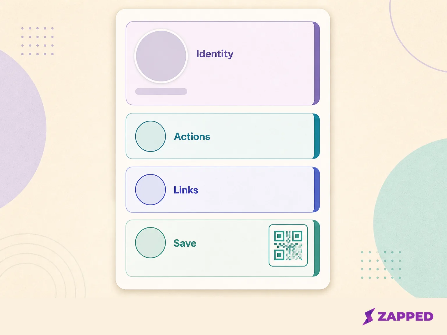
Put the name, role, and photograph in an identity container. Put the action someone’s most likely to use next in its own container, usually a button for contacting or visiting the person. Keep social profiles and secondary links in a separate links area. Elementor’s container model lets you keep the identity, actions, and links distinct while they still belong to one profile.
Flexbox gives you the controls that matter here. Flexbox layout controls determine whether elements sit beside one another or stack, and keep the important action from drifting away from the identity it belongs to. A small page benefits from this restraint. Four deliberate areas beat a miniature homepage with every possible link competing for the first tap.
Elementor’s Button widget tutorial shows how to add and style a Button widget in a container. It isn’t the same thing as a save contact control. Decide which behavior you need before adding a widget that promises more.
Make the phone version the release candidate
A profile can look tidy on a wide canvas and still hide the useful part on a phone. Set the desktop layout, then switch to each responsive breakpoint and make the next action obvious without asking someone to hunt for it.
Elementor lets you adjust responsive containers by breakpoint, including their width, height, and the order of widgets or containers. Use that to move the primary contact action above the supporting links when the screen narrows. Let the identity establish who the person is, then make the action visible, then stack the rest.
Keep the spacing generous enough for a real thumb and check the page with the content you’ll actually publish. This is also where Elementor’s container guidance matters: a clickable container can’t contain a Button widget, because both create links. Choose one interaction model for each area. Nested click targets are a small design shortcut with an annoying failure mode.
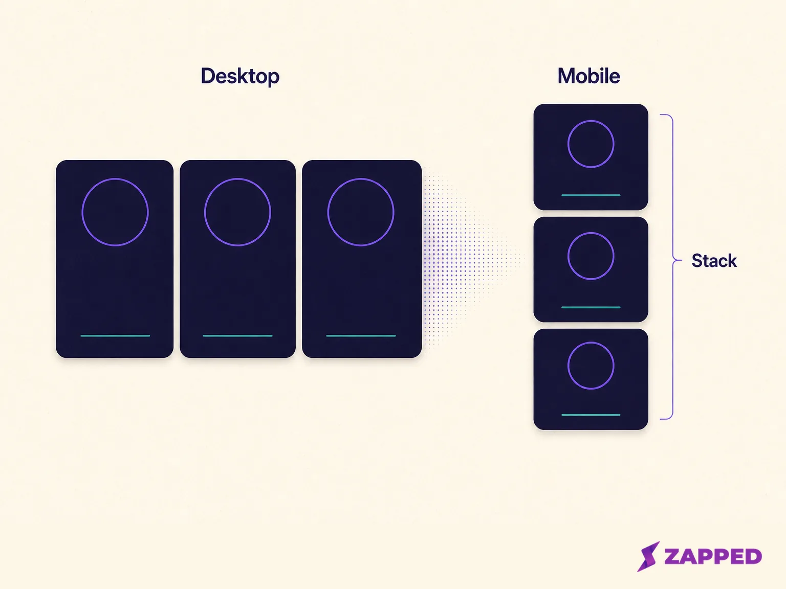
The release check is simple: on a phone, can someone identify the person, find the main contact action, and reach the supporting links without guessing? If not, change the order or spacing before polishing colors.
Know when a button is actually a vCard
The word vCard changes the decision. A normal Elementor button can send someone somewhere. A vCard action is meant to package contact fields so the visitor can save them, and a QR action gives the visitor another way to reach that profile.
Unlimited Elements’ vCard widget documents fields for a name, company, role, phone, email, website, and address, along with a vCard button, QR code, and contact buttons. It’s a Pro feature, not a free widget. When checked in August 2026, the annual plans started with a $49 Starter plan, followed by $99 Professional, $149 Business, and $199 Unlimited.
That makes the widget a behavior purchase, not just a styling purchase. If a normal link is enough, keep the page native and avoid paying for a contact record you don’t need. If saving details is why you’re building the card, document the widget’s exact action and test the visitor path before you commit the design around it.
The same test applies to templates. A polished template can shorten the first styling pass, but its vCard button still depends on the feature the template or its companion widget actually provides. Judge the action, not the badge in the template preview.
Know when the page stops being the product
One designed profile is a good Elementor job. A system for many profiles is a different brief.
Requests in the Elementor community discussion describe editable profile pages, customer logins, and cards sold with NFC hardware. A WordPress support discussion draws the same line more sharply: one page for a vCard is one use case, while 45 cards, templates or subdomains, and individual user control are separate requirements.
If one person owns the page and edits the details, Elementor fits the workflow. If each customer needs to sign in, edit only their own card, receive a separate address, or share management with a team, stop adding widgets to a single page and evaluate a profile platform. That isn’t a failure of the page builder. It’s the moment the job becomes data and permissions as well as layout.
If you want browser first sharing
There’s a clean fallback when maintaining a WordPress page isn’t the point. Use a browser first card service and link to it from the site or a QR code, so the card behavior is handled somewhere built for sharing.
We build Zapped, so weigh this as our own example. Its homepage says a free digital business card can be shared by link, QR code, or NFC tap and opened in a normal browser without an app. That’s useful when the recipient should reach a card and save the details without being asked to install anything.
The current Free plan is one card and five content blocks, plus a QR code, shareable link, and a 60 day analytics snapshot. That’s a compact browser first route, not a replacement for controlling every pixel of an Elementor page. Choose it when distribution and saving matter more than owning the page layout.
The practical call
Use Elementor when you already maintain WordPress and want a short profile page you can shape precisely. Start from a blank page if the content order is clear. Start from a template if the first styling pass is the bottleneck, then check what its vCard behavior actually depends on.
Keep identity, the primary action, and supporting links in separate containers. Make the phone layout the real release candidate. Add a vCard widget when saving a contact record or showing a QR action is essential, not because “digital business card” sounds as if it requires one.
If the requirement has become dozens of editable cards, individual control, or easy sharing without maintaining WordPress, use a browser first card service instead. The best Elementor digital business card is a short, deliberate profile page, not a tiny website stuffed into one screen.