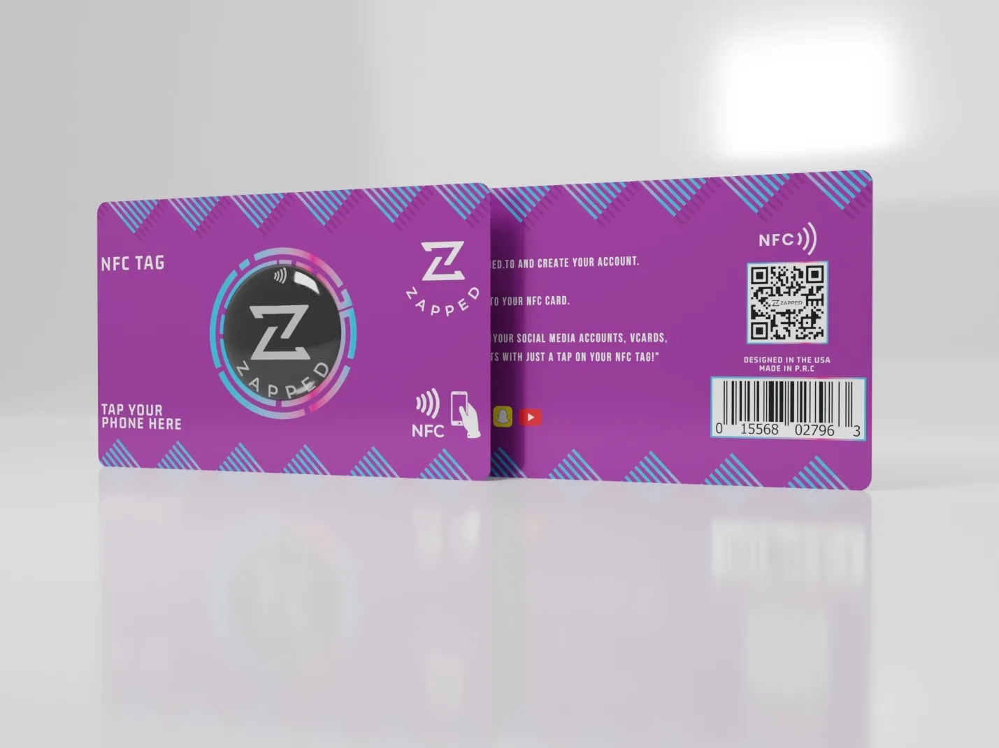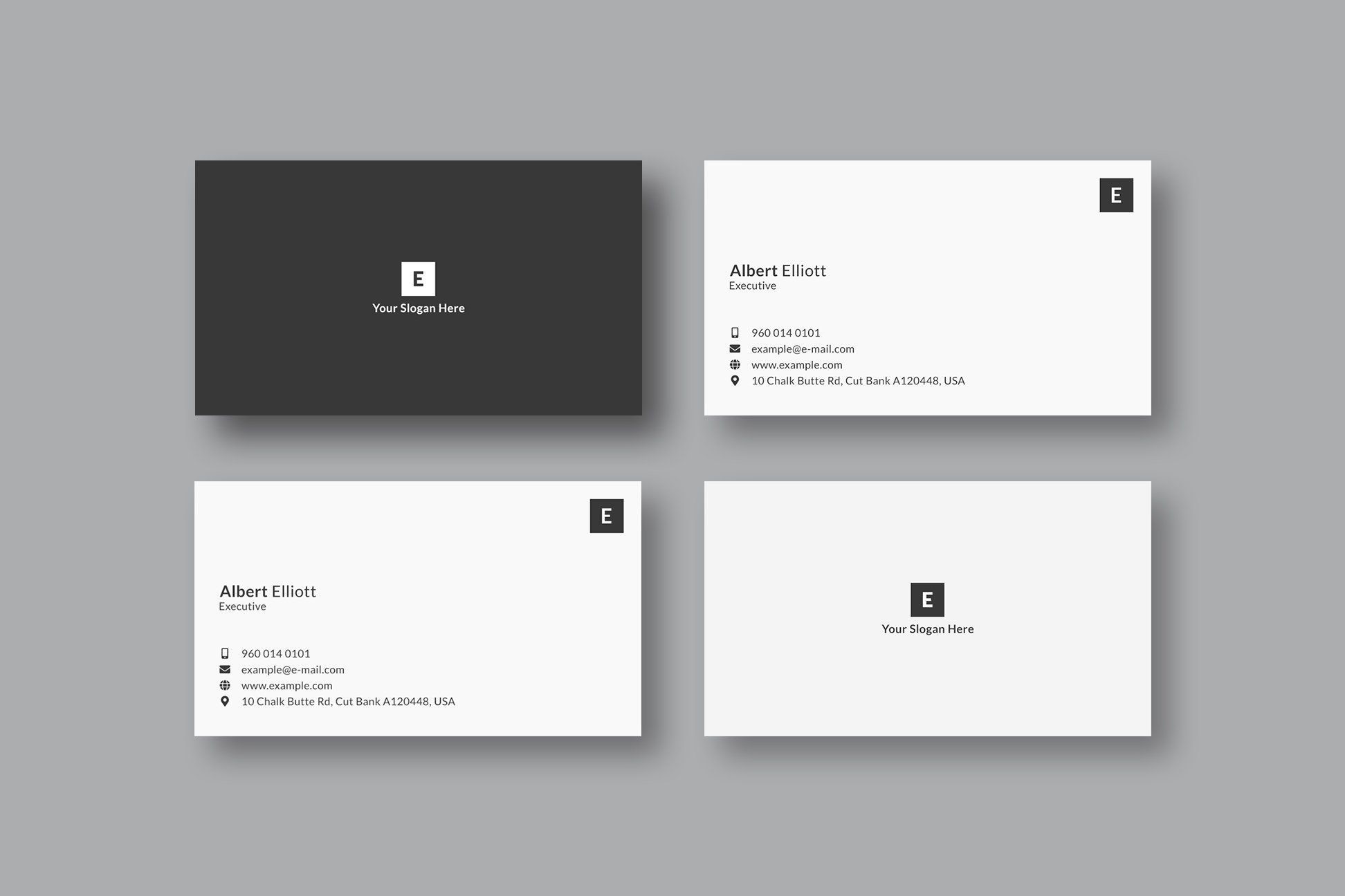
Avoid common smart business card mistakes in layout, QR placement, NFC setup, profile design, and follow up.
Quick answer
The biggest smart business card mistake is making the card look modern while the profile behind it is unclear. A smart card needs a readable design, scannable QR code, tested NFC path, clear save contact action, and a profile that tells the recipient what to do next.
Key takeaways
- Make the recipient journey clear before choosing the card format.
- Use QR or NFC as entry points, not as the whole strategy.
- Point scans and taps to an editable destination whenever details may change.
- Test the complete flow before printing or rolling it out.
What this means in practice
Design mistakes usually happen when the physical card gets all the attention and the recipient journey gets almost none.
A refreshed business card should answer three questions quickly: who is this person, why should I care, and what should I do next? When the card points to a live profile, those answers can change as the business changes.
Practical checklist
| Check | Why it matters |
|---|---|
| Clear primary action | The recipient knows whether to save, book, call, review, or buy |
| QR code backup | Works even when NFC is unfamiliar or disabled |
| Editable profile | Keeps old cards and links useful |
| Mobile speed | Most scans and taps happen on phones |
| Useful links | Supports the next step instead of creating clutter |
| Team ownership | Prevents stale employee profiles and off-brand cards |
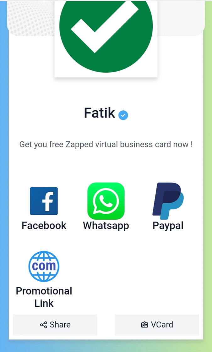
This visual shows how the card design, scan path, and profile destination work together.
How to use this well
Start with the outcome. If the goal is a saved contact, make the save action obvious. If the goal is booking, put the booking link near the top. If the goal is local trust, include reviews, service area, and a clear way to call or request a quote.
Do not send every person to a generic homepage. A business card scan or tap should open a page made for that handoff. The page can still link to the full website, but it should not make the recipient hunt for the basic next step.
The biggest design mistake
The biggest smart card design mistake is focusing on the object and forgetting the destination. A premium NFC card or beautiful QR layout still fails if the profile is slow, unclear, outdated, or missing the next action. The design should support the follow-up path, not just look impressive in a photo.
Before printing, ask what the recipient should do in the first 10 seconds after opening the profile. If the answer is not obvious, simplify the page.
Practical preprint review
Check contrast, QR size, quiet zone, NFC placement, URL spelling, logo readability, and whether the card still makes sense without instructions. Then test the digital side: tap, scan, open, save contact, click the top links, and view the profile on both phone platforms. Most expensive mistakes are found in this simple test pass.
Make the card useful with Zapped
Zapped gives the card a live destination instead of locking every detail into print. The same profile can support QR codes, NFC taps, direct links, email signatures, social links, booking pages, and save contact actions.
That is the practical advantage of a digital card: people still get a simple handoff, but you can keep the profile accurate after the card is shared.
Examples by use case
For a conference card, the profile might show a headshot, role, company, calendar link, LinkedIn, and one event-specific offer. For a local service card, it might show phone, service area, quote request, reviews, and a photo gallery. For a sales team, it might show product links, meeting booking, company page, and a save-contact button.
The format changes, but the principle stays the same: the card should continue the conversation that started in person. If the recipient only needs your phone number, keep it simple. If they need context before they act, give them the proof and next step in the profile instead of trying to squeeze everything onto the printed card.
Before you publish or print
Use this final pass before the card goes live:
- Open the profile from the exact QR code or NFC chip that will be used.
- Confirm the profile headline, photo, company name, and primary action match the real handoff.
- Test the save-contact action and every high-priority link on iPhone and Android.
- Check that the printed card still works if the recipient ignores NFC and scans the QR code instead.
- Ask one person outside the project to scan it and explain what they think the next step is.
That last test is valuable because most card problems are clarity problems. If the person hesitates, the profile or printed card needs simplifying before it reaches customers.
FAQs
Do people need an app to open the card?
No. A strong recipient experience opens in a normal browser from a QR code, NFC tap, direct link, or message.
Should I use QR or NFC?
Use QR when visibility matters and NFC when fast close-range sharing matters. Many business cards should use both.
What should the profile include?
Include contact details, a save contact action, website or company link, and the most important next step for that audience.
How should I test the card?
Test the QR code, NFC tap, page speed, save contact action, and important links on both iPhone and Android before printing or sharing widely.
Sources
- NFC Forum technical overview for NFC tap behavior and common NFC use cases.
- IETF RFC 6350 for the vCard contact data format.
- Google Business Profile review guidance for review link and QR code workflows.